PANEL PRESENTATION – EDGE 1999
FROM COMPUTER SCREEN TO CERAMIC SURFACE
I’m hoping that by relating the order of events that led me to my present situation it will lend some reason to my work in the digital realm. I will basically follow the chronological order of events of my decal experiments and hope it all falls into place.
I’ll talk about
· My early decal making experiments
· Surface as a ground for imagery
· Looking in to look out (shifts in perception)
· Panorama · The digital realm
· The virtual vessel
· Speculation and object
After graduating from East Sydney Tech in 1973 I then worked for 2 years as a screen printer to fund setting up my first studio/kiln. I always had it in mind to join the 2 disciplines of printing and pottery. It wasn’t until 1985 that during a period of public access to the Art department of the Northern Rivers College of Advanced Education, Lismore NSW that I had the opportunity to try out my plan. The college was equipped with a screen printing facility and a pottery. I had an idea what a decal was and I knew the basics of on glaze enamels but I had a lot to discover. The images that I made at this time survive as left over decals except for one photograph of the only pot that I managed to keep. At that time surviving from day to day had priority over documentation. The work is hand drawn with a pen on a transparent paper and each colour is individually drawn in this way. A screen is made for each colour and they are printed one at a time to build up the image.
 The Night Entities flying through the landscape crop up from time to time, representing inner aspects of my self that may or may not be apparent.

Figures /Landscape is interesting for me because it has the window through which to look out, the drawing involves shifting viewpoints but ultimately there is escape to the fantasy landscape out the window.

Couple at the Window is similar, once again it features the window, it is a night scene that deals with the notion of the soul mate.


After Picasso depicts the Blind Minotaur being led by the Little Girl placed into my fantasy landscape, I related to this series by Picasso after seeing a major touring exhibition around that time. The form is typical of the work I was doing at this time. The jar defiantly has an inside and an outside that are separated by the lid. The bulging surface was an aspect of my forms before the printed image but the textural element of the surface had already started to become flattened.
For the first few years I used dry on glaze material mixed with clear decal lacquer as my ink and clear decal lacquer as my covercoat. I was very encouraged when (after a few technical blunders) I actually got the decals to work.
A decal is a slide transfer. The image is printed onto a gum-coated paper and covered with a transparent layer of ink, known as a covercoat. This covercoat becomes the vehicle for the image to slide off the paper when it is soaked in water. The image is then applied to the surface on which it is wanted.
For me the surface of a pot has been the ground on which to apply imagery.

I have used a multitude of techniques to achieve this purpose. Applying colour to the surface of a pot was always with a restricted pallet in high-fired ware, so I was attracted to the promise of a full colour range in on glaze colours.


There have been two themes or concepts that have stayed with me throughout my practice. One is that of the vessel as metaphor for body and the other has been that of looking in to look out. The first one is fairly straightforward; it is about containment, the vessel as container is metaphor for the body containing the spiritual self. Looking in to look out came from years of drawing scenes around a pot that depicted a continuous landscape. The 360º of the panorama are mirrored in the 360º of the cylinder- the basic pottery form. But it wasn’t until I flattened that cylinder into a cube and drew ‘windows’ through which to view the landscape that I fully comprehended what I was doing. Having done that I resumed in the round pots but with a new understanding. The net result of this realisation was that I was offering a shift in perception through which to view the work. This shift in perception becomes more important in all my following work.
The shift in perception is in fact a metaphor for a shift in consciousness. I’m talking here about environmental, spiritual and aesthetic consciousness.
The shift in perception is in fact a metaphor for a shift in consciousness. I’m talking here about environmental, spiritual and aesthetic consciousness.


In 1991 I moved to Perth during a period of continuous intermittent travel. I set up a small studio at my house in Doubleview. This jar has the Perth Cityscape drawn around it and is indicative surface treatment I was dealing with at that time. At the moment of realisation that one is looking into the pot to look out, the solidity of the jar has a momentary collapse. The shift is like that of the anamorphic image. The visible area of the image is also a mirror of our own visual angle of perception. We can only imagine what is behind us unless we turn around.
While in Perth I continued my research into decal making. I found a screen printer who exposed my stencils at a reasonable cost and I fired the onglaze at the local pottery supplier. I was still using dry onglaze mixed with decal lacquer but I discovered commercial covercoat that was stronger than what I had been using and made application much easier.
While in Perth I continued my research into decal making. I found a screen printer who exposed my stencils at a reasonable cost and I fired the onglaze at the local pottery supplier. I was still using dry onglaze mixed with decal lacquer but I discovered commercial covercoat that was stronger than what I had been using and made application much easier.

These cups have a design printed on them for the Perth Dingy Sailing Club, for the National Championships of 1992.

Post Feminist Deconstruction Zone uses the decal in a different way. The sexy legs being repeated around the form. Up until this time all my decal designs were hand drawn. Photographic separations were expensive and I had not yet discovered the computer.
When I did discover the computer, as part of my return to art school as a printmaking student in 1994 at SCU, the single aspect that attracted me was that I found out they had the capacity to do colour separations at the push of a button.


Little did I realise the consequences of this attraction because I have been pushing buttons ever since. I discovered that computers do a lot more than separate colours.
By 1996 I had been seduced by the design possibilities of the digital realm and my decal making reflected the obsession that was to follow. What comes with the world of computers is the Internet, and much of my source material was images that I could access in this way. My favourite sites were those that gave away pictures of space objects, often photographs from Hubble space telescope. I composed images from these astronomic objects and worked them into my art. Although still using the colours I had been using for decal making all the time I was now approaching the 4 colour separations that I knew were possible. The other aspect of computers that I did not expect to fall into was the world of cyberspace. 2D imaging was exciting enough but when I discovered the 3D world of the computer screen opportunities began to emerge.
 Decal Bowls 1996 features artworks from video grabs of the television shows I had recorded about the history of art. The speculation that emerged in relationship to surface treatment was starting to explode within me.
Decal Bowls 1996 features artworks from video grabs of the television shows I had recorded about the history of art. The speculation that emerged in relationship to surface treatment was starting to explode within me.
I created a body of work that I saw as virtual ceramics, using textural surfaces of my most recent fired ware and images of outer space objects I constructed imaginary worlds that dealt with my notion of ‘shift in perception’ and turned it completely up side down. It was only my involvement in the ceramics industry that allowed me to contemplate such a creation but the conceptual depths that were opening up to me were far too speculative for me to comprehend in any kind of legitimate way. 


When the call came out for submissions for Virtual Craft for the show Craft is Dead -Long Live Craft I had been heavily into creating textural plains from photographs of places around Hobart, where I had transferred my study. The theme was about reflections, on the water and on the screen, slightly mirrored images from which I was trying to arouse some profound personal reflection. I had these images in the computer waiting to be used as surfaces to reflect that cyberspace environment that was calling me to attention.
Here is an example of how my surfaces are created. From these two photographs of a wall and a river dawn I create a new composition and use that with this reflection of posts in the water to use in the Virtual space of Reflective States 2
I’ll show you quickly a few more of my reflections compositions and you can see how they operate as surfaces and environments in my work for Craft is Dead Long Live Craft.
**(ad lib slides to Panorama)
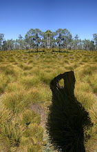
This notion of the Panorama as a surface for my ceramics appeared as flattened images for my project in 1998. I kept the periphery of the visual field in the realm of the imagination, just like in our own perception of the world around us or in the other side of the pot. This imagined zone is inhabited by the floating entities of the psyche. The central view alone is designated the status of the “prospect”, submitting to the direct gaze of humanity. Everywhere else that shift in perception is lingering to capture your visual awareness. Hartz Mt and Roaring Beach are two out of a series of about 26. They were objectified in a variety of ways.1www.jpg)
2www.jpg)
Here is an example of how my surfaces are created. From these two photographs of a wall and a river dawn I create a new composition and use that with this reflection of posts in the water to use in the Virtual space of Reflective States 2
I’ll show you quickly a few more of my reflections compositions and you can see how they operate as surfaces and environments in my work for Craft is Dead Long Live Craft.
**(ad lib slides to Panorama)
This notion of the Panorama as a surface for my ceramics appeared as flattened images for my project in 1998. I kept the periphery of the visual field in the realm of the imagination, just like in our own perception of the world around us or in the other side of the pot. This imagined zone is inhabited by the floating entities of the psyche. The central view alone is designated the status of the “prospect”, submitting to the direct gaze of humanity. Everywhere else that shift in perception is lingering to capture your visual awareness. Hartz Mt and Roaring Beach are two out of a series of about 26. They were objectified in a variety of ways.
1www.jpg)
2www.jpg)

Roaring Beach became this mixed media piece featuring ceramic decals at the periphery, printed paper in the intermediate zone and back lit film as a light in the centre.
The decals for the tiles were printed with commercially prepared four colour process onglaze pigments. I was quite pleased with that product and continue to use that system.
Bringing the Virtual Ceramics back to the world of the object is a natural extension of my work process. Once again trying to promote some thoughts that question just what is going on. This year I have continued with the panorama but have added the aspect of time, sound and movement. Two examples of this are Melbourne and Cape Roul. The animation of Cape Raoul is a feature of my latest Virtual Ceramics project.
I am once again involved in the notion of reflection and movement or shifts in perception. The surfaces of the virtual vessels mirror the animated environment similar to the reflections that reveal 19th century anamorphic images in mirrored tubes.


No comments:
Post a Comment